LifeMart™
Who gets to put a price on a life?
Who gets to put a price on a life?
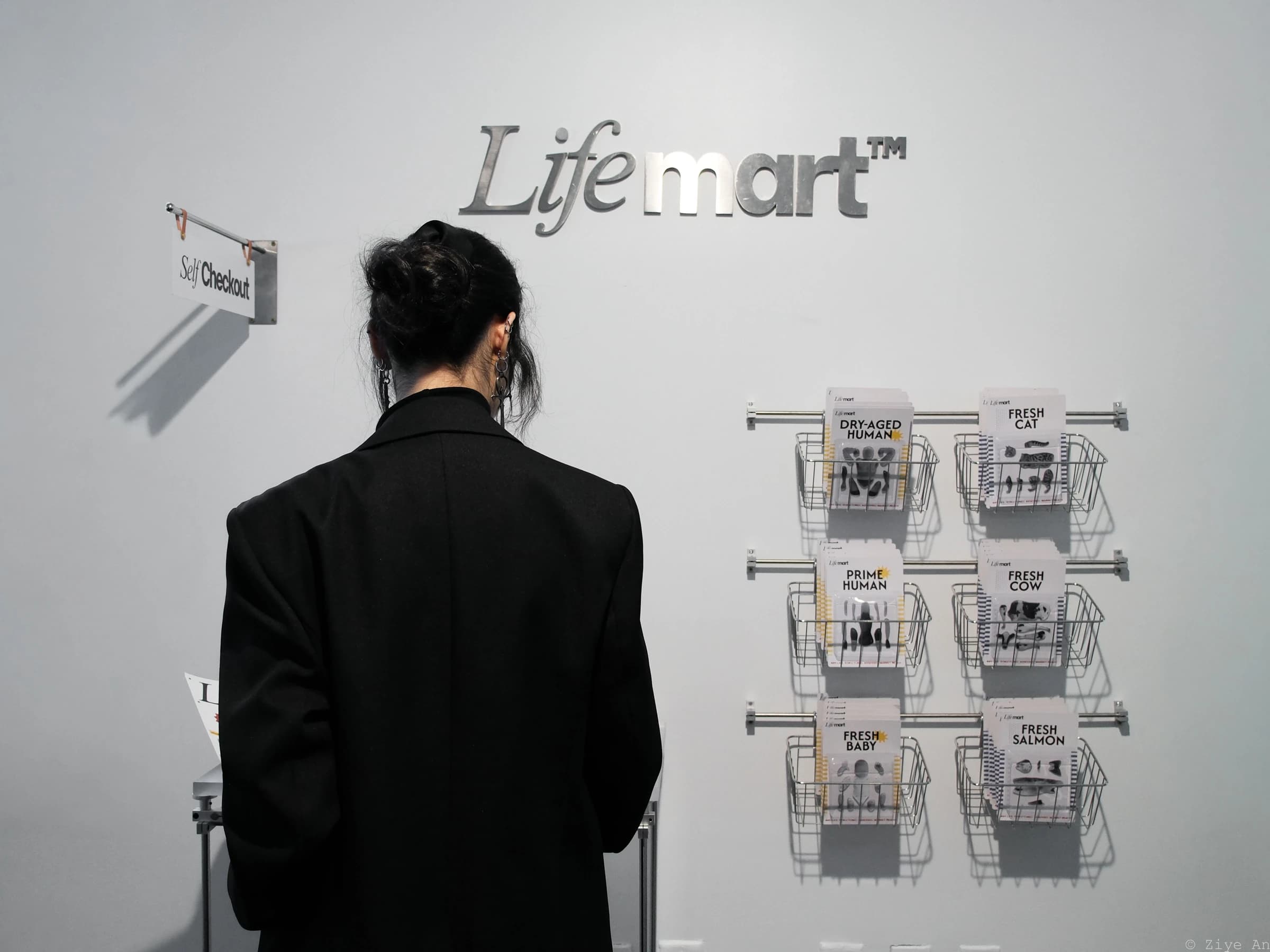
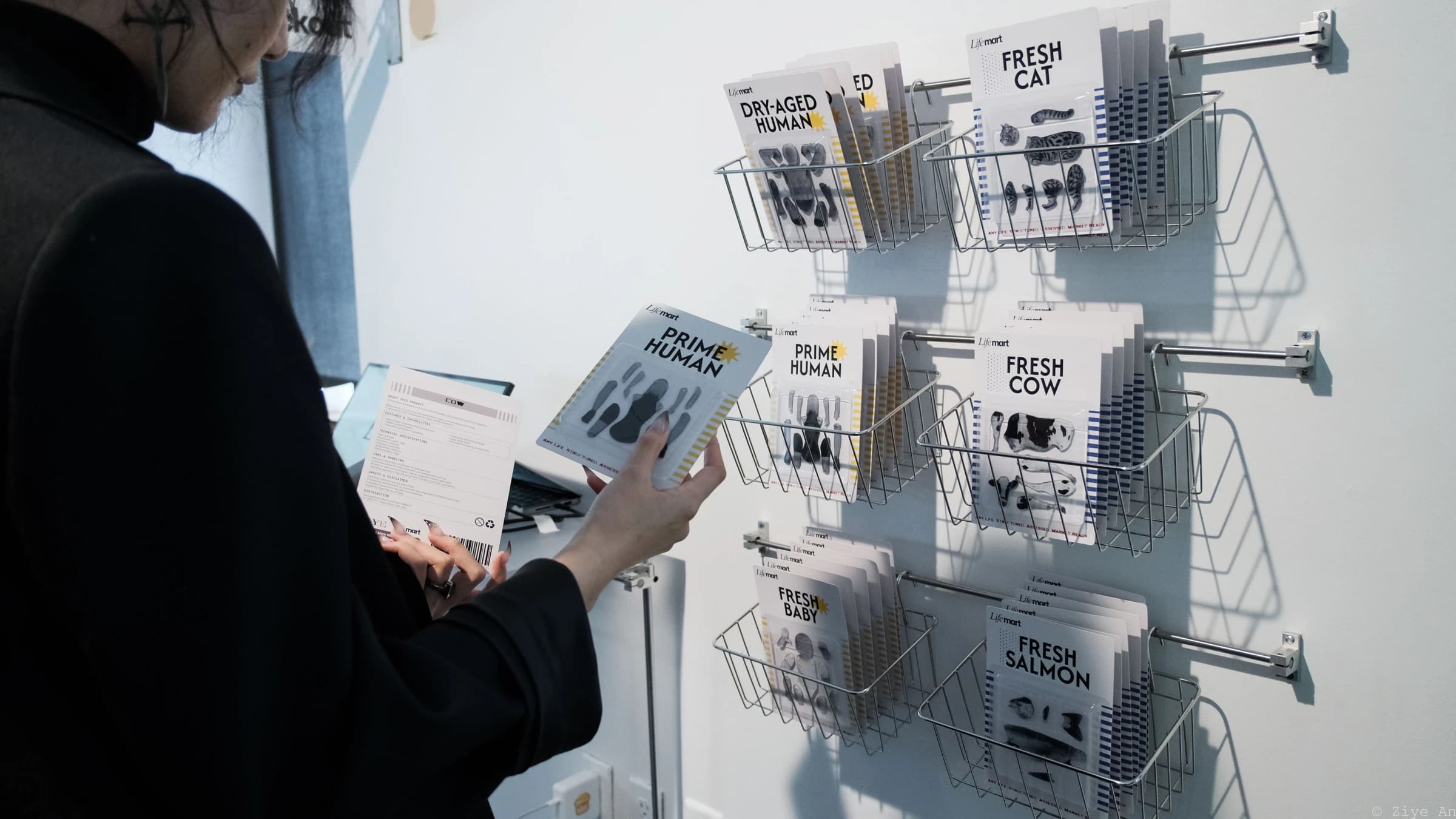
LifeMart™ is a critical design installation staged as a pop-up store. Visitors pick up a packaged human or animal, scan its barcode, and use coupons to switch between systems of valuation. The same life acquires a different identity, image, and price depending on the system applied.
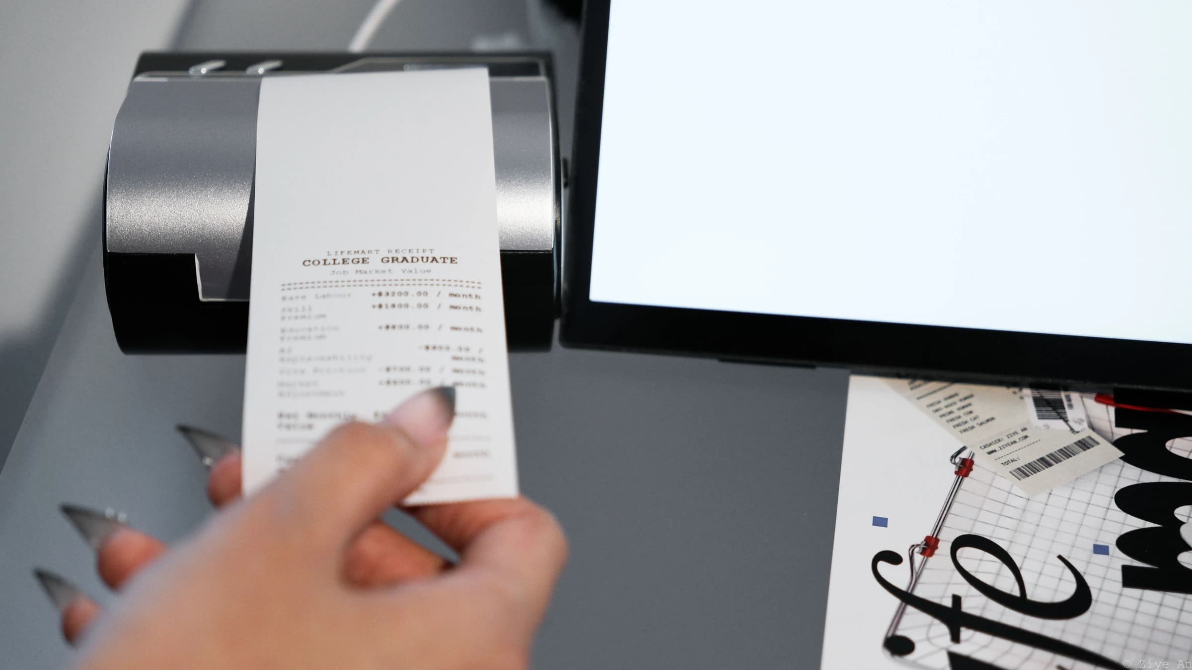
For humans, the lenses include the job market, insurance, and bodily resources; animals have their own corresponding categories. Visitors can choose any coupon directly. At checkout, a receipt makes the selected valuation tangible. Leaving without a price is also possible, but requires staff authorization.
I used secondary research to examine how institutions distinguish between lives that can be owned, used, protected, or mourned. The research brought together biopolitics, market value, and human–animal relationships, including the tensions between “zoe” and “bios,” and between killability and grievability.
This led to a design question: how could someone encounter these abstract distinctions through an everyday action? Self-checkout places the visitor at the moment a value is assigned. Coupons let them apply a different institutional lens, while the receipt turns that choice into something they can hold. I developed the valuation rules through secondary research and AI assistance; the prices belong to the work’s constructed scenario.
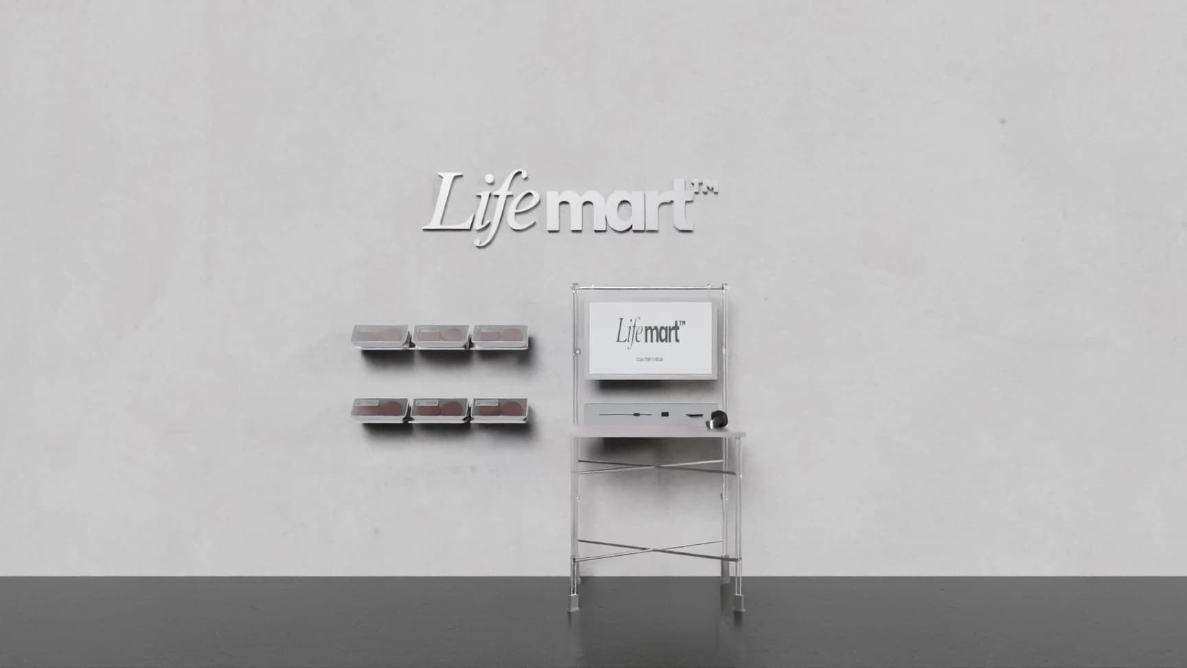
An early 3D study explored how the product display and self-checkout station could share one retail setting.
Across approximately 5–6 rounds with around 10 participants, I asked people to explore without instructions, then discussed what they thought the work meant. Early slider and web-only interactions did not make the intended concept clear enough.
I compared a web-only prototype with a scanning prototype, observing exploration and asking about subjective preferences. This process informed the choice of scanning: I wanted the interaction to feel like an actual act of consumption. The comparisons focused on interaction feasibility, exploration, and how participants interpreted the work.
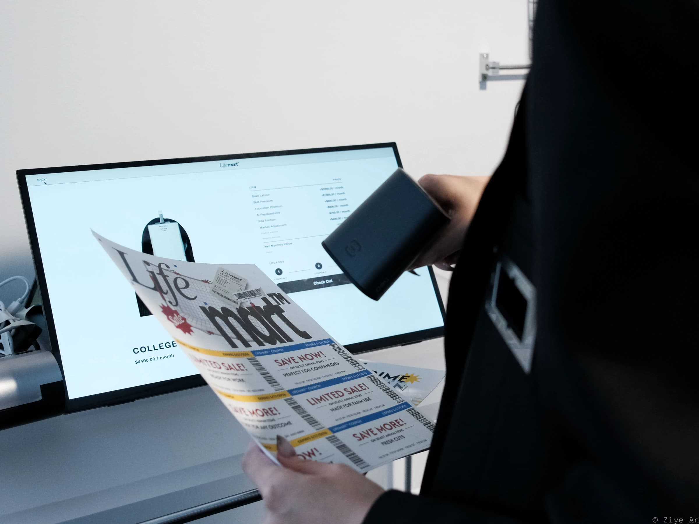
The experience begins with a life that has not been priced. Scanning a coupon changes the valuation lens and the representation on screen. The three coupons can be selected in any order; they are alternatives to explore, not a required sequence.
Human and animal layers differ. Coupon wording and packaging colors correspond to these differences, carrying the rules beyond the screen. The design asks visitors to notice what each system chooses to recognize—and what disappears when a life becomes a category.
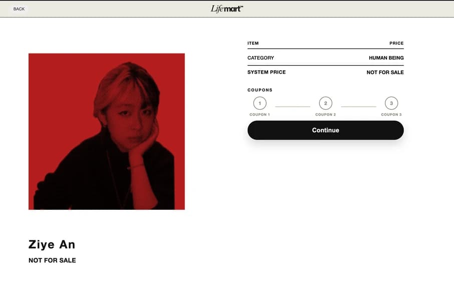
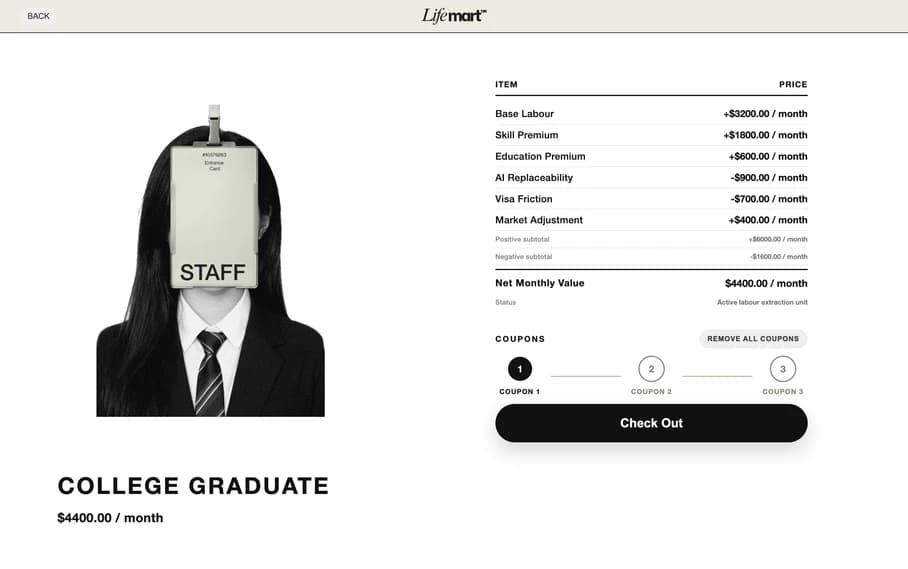
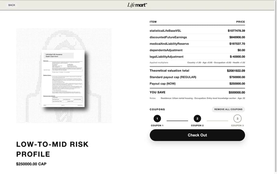
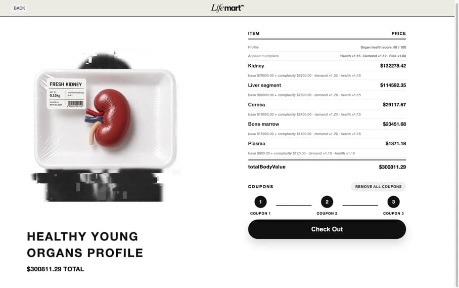
I designed the flow and interface in Figma, including the decisions around changing items, coupon eligibility, clearing coupons, and checking out. A 1/2/3 indicator encourages visitors to explore all three layers without prescribing their order.
Pop-ups and voice prompts support the familiar checkout interaction. The system explains when a coupon does not apply, asks for confirmation before replacing an item or removing coupons, and offers a route to checkout without coupons. Designing these branches made the experience coherent beyond its main path.
If a visitor uses no coupons, or cancels them all, an alternative ending becomes possible: a receipt with the life’s photograph and no pricing breakdown. To reach it, they must ask the store attendant—played by me—to scan an employee authorization code.
I deliberately made this outcome less immediate. The intervention echoes the permissions of real self-checkout machines, while making it difficult to step outside every system of valuation. The photograph gives the visitor a different kind of takeaway: an encounter with a life that the receipt does not reduce to a price.

I designed the packaging in Adobe Illustrator, with colors and coupon copy that correspond to the human and animal systems. Products, promotional posters, coupons, and store signage establish a shared retail language so the conceptual premise can be encountered through familiar objects.
I developed the website with AI assistance and presented it in Google Chrome’s kiosk mode. Physical production included printing, cutting acrylic, and CNC-cutting metal for the pop-up installation. The work brought interaction design, interface design, fabrication, and live facilitation into one experience.
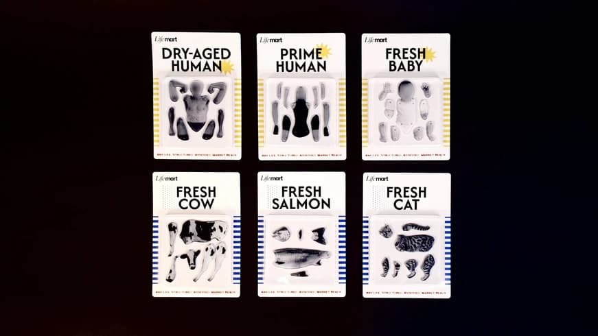
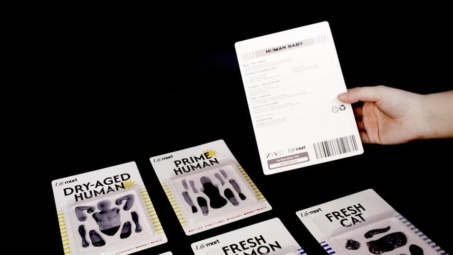
LifeMart taught me to test whether an interaction communicates an idea, as well as whether someone can operate it. The shift toward scanning connected the concept to a familiar behavior; the staff authorization step used a familiar obstacle to make refusal meaningful.
I learned to connect a research question to specific rules and touchpoints, then use qualitative testing to examine that connection. In this project, ease of use and deliberate friction each had a role: one invited exploration, while the other made an institutional constraint felt.